you are reading /
Tarot-Inspired Logo design challenge: Episode One
Tarot has always held a special place in my life. I’ve always been drawn to it, everything from the deep symbolism and introspective energy to the gorgeous imagery. I collect tarot decks just for the art alone. They’re one of my biggest creative inspirations.
That’s why I decided to try something a little wild: designing a logo based entirely on tarot cards. It’s a challenge that merges intuition, creativity, and design, so naturally, I was all in.
Why Tarot?
My work is heavily inspired by all things mystical, symbolic, and nature-based, tattoo art, books, films, folktales, and especially tarot. My own branding leans into the tarot aesthetic because I see it as a tool for growth and self-reflection. And that’s exactly what my brand is about: reconnecting with yourself and expressing your essence through design.
Throw in some witchy, occult symbolism and I am so there.
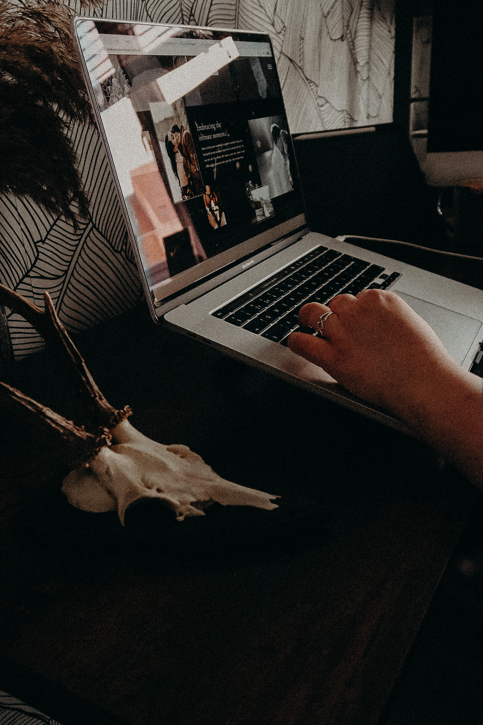
I’ve used tarot as inspiration many times before, and I’m even working on a series of website templates inspired by tarot (coming soon!). So this challenge felt like the perfect next step.
Why a Logo Challenge?
I’m always dreaming up new ideas for logos—they’re one of my favorite ways to explore storytelling through design. A logo can be anything: symbolic, whimsical, deeply personal, or just flat-out magical.
In my client work, people come to me with the most amazing, out-of-the-box ideas. I’ve created logos featuring:
- 🦄 A unicorn
- 🛡️ A lady knight
- 🌌 Two lovers floating in space
(Yes—those are all real designs I’ve done!)
These are the projects where I thrive: where someone shares a wild, one-of-a-kind vision, and I get to turn that into a design that captures their essence.
So this challenge, letting the tarot guide me into the unknown, felt like such a fun way to spark creativity and see what would emerge when I handed over the reins to something symbolic and intuitive. I had no idea what the cards would throw at me… but that was kind of the whole point.
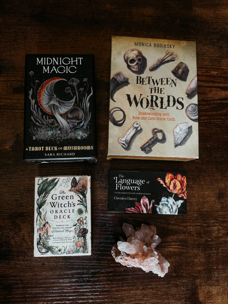
The Decks I Used
I chose a few decks that I love for their mood, tone, and visual energy:
- Green Witch’s Oracle
- Between the Worlds
- Language of Flowers
- Midnight Magic
Step 1: The Tarot Pull
I pulled one card from each, and here’s what the cards had to say:
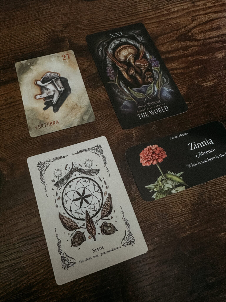
Cards Drawn:
- Between the Worlds – The Vertebrae
“Sometimes we need support from others, but sometimes we need to be our own support system.”
🦴 Represents inner strength, structure, and personal resilience. - Language of Flowers – Zinnia: Absence
“What is not here is the key.”
🌸 Suggests reflection, hidden truths, and making peace with the unseen. - Green Witch Oracle – Seeds
New hope, new ideas, and open-minded beginnings.
🌱 A symbol of potential, growth, and fresh starts. - Midnight Magic – Honey Mushroom (The World)
🌍 Upright meaning of The World in tarot: fulfillment, wholeness, and completion. Everything comes full circle.
What it all means together:
This reading felt like a quiet, powerful message: you are your own support system. Even in the absence of certainty, you can plant seeds of new ideas and grow into something whole. That was the vibe I wanted to translate into the logo, something grounded, organic, and gently powerful.
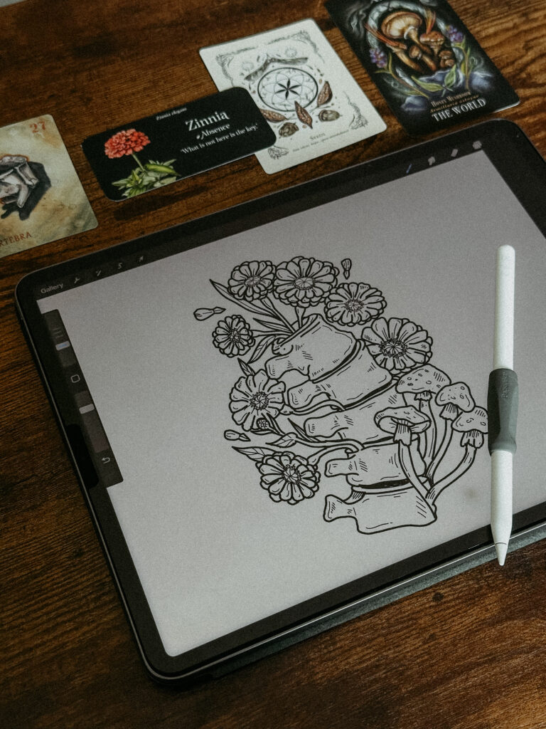
Step 2: Sketching in Procreate
I started by looking up reference images on Google: vertebrae, mushrooms, zinnias, and seeds. I imported them into Procreate on my iPad Pro and began rough sketching over them to block out the base shapes I wanted to work with.
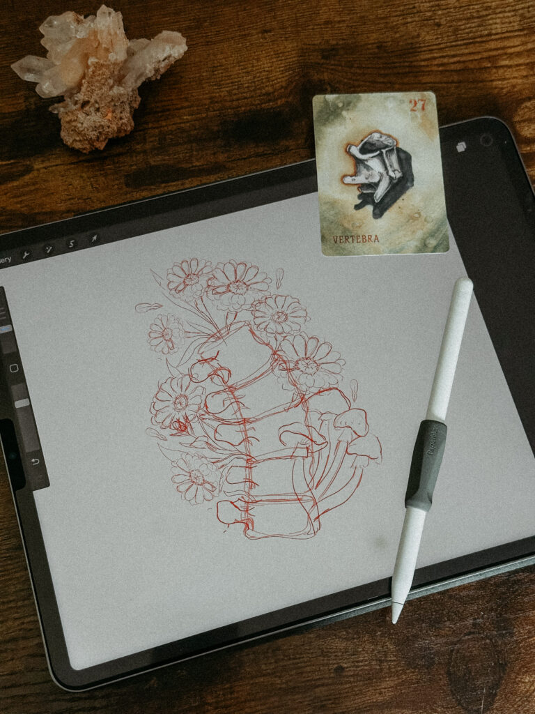
Once I had my elements, vertebrae, flowers, mushrooms, seeds, I deleted the reference images and began arranging everything into a good composition.
I knew I wanted the flowers to grow out of the vertebrae, not just around it. To me, that symbolized the idea of growing from your own strength. Like, supporting yourself and encouraging your own growth leads to something beautiful.
Step 3: Outlining & Detail Work
With my layout locked in, I moved on to clean outlines. I traced around each element with a steady brush, then went in with a finer brush to add smaller details and shading lines, like texture on the mushrooms, contours on the vertebrae, and gentle shadows on the petals.
It’s one of my favorite parts of the process, it’s where the piece starts to feel real.
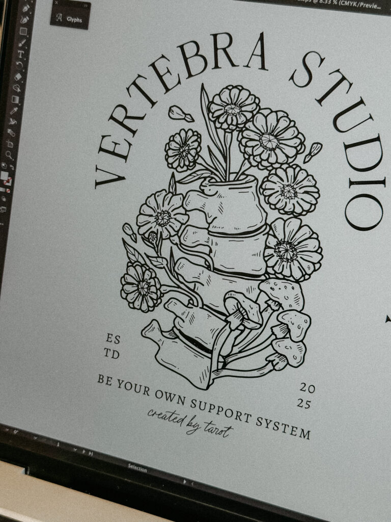
Step 4: Vectorizing in Illustrator
Once my drawing felt finished in Procreate, I exported it and brought it into Illustrator on my MacBook.
From there:
- I used Image Trace to convert the sketch into vector format
- Cleaned up any messy lines or shapes
- Added the text and played with font pairings until it felt right
I looked for something that balanced mystical and modern, elegant, readable, but still with a little arcane flair.
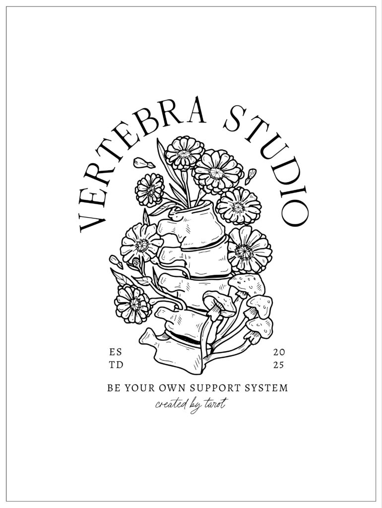
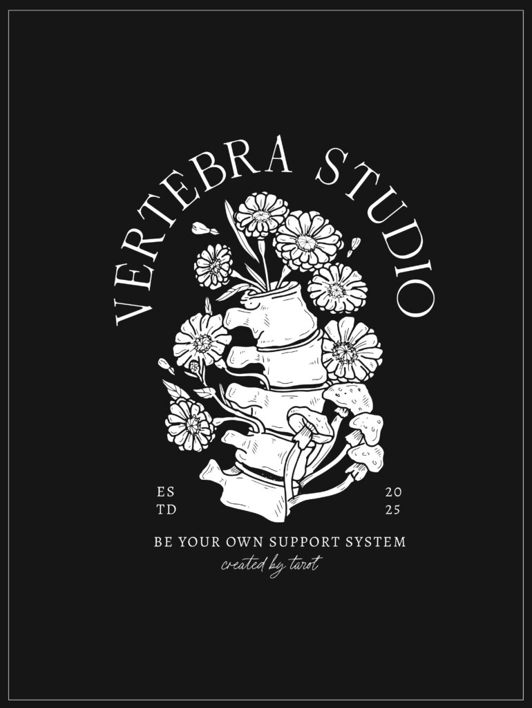
The Final Logo
And voilà! A logo completely created from intuition, symbolism, and a little bit of magic ✨
Every piece of it tells a story, from the strength of the vertebrae to the growth of the seeds, to the gentle presence of what’s absent.
Final Thoughts
This challenge was SO much fun, and honestly, kind of enlightening. I loved letting go of logic and letting the cards guide the direction. It’s a method I’ll 100% use again, especially as I continue developing tarot-inspired designs and website templates.
I’m already excited (and a little scared) to see what the next tarot pull will throw at me. Who knows what symbol I’ll be drawing next!
filed IN /
MOST POPULAR
Showit website design for photographers