few space left for 2026 / now booking for november & december.


you are reading /
Brand Design, Missouri Wedding Photographer, S.Davis Photo co
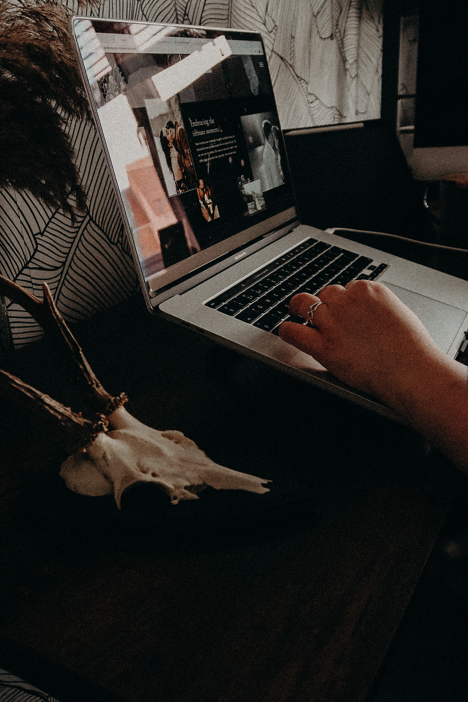
In this blog post, we’ll be talking about the ideas and inspiration behind our recent Brand Design for Missouri Wedding Photographer, S.Davis Photography.
The inquiry:
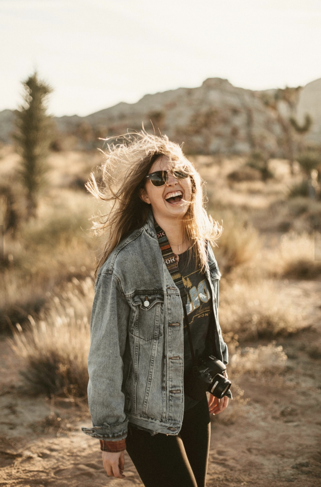
Sam reached out to us at Kern & Ink, all thanks to a recommendation from a previous client. In her inquiry form, she let us in on a little secret: she’s a true romantic. But not the usual light and airy photographer. Nope, she’s the kind with a raw, vulnerable undertones. She described this type of romance she’s all about as, ‘Remember how people like their coffee—loving them at their ugliest, in those intimate moments, and sharing salty kisses after a long workday kind of love stories.’ And we were all in on this idea! We were super keen to dive into Sam’s moody, gritty, and romantic vibe. And build a brand that’s not just warm and cozy. But also packs a punch of grit, authenticity, depth, and moodiness to fully capture those ideals.
Sam came to us feeling a tad overwhelmed about injecting more of herself into her brand. She was a little nervous about really expressing who she is. We get it—sometimes, it’s hard to put these things into words. That’s why we take it easy and laid-back when getting to know our clients. We ask them to whip up a Pinterest board so we can get a feel for their style and visuals. But the real magic? That’s in our questionnaire. We tell our clients to spill it all out, no holding back. Ramble, go on tangents, overshare, heck, even repeat yourself. Why? Because when we get to hear the real, unfiltered you, and you approach our questionnaire like you’re chatting with a friend, that’s when we create something that’s uniquely you.
Her mission for this project was clear: she wanted something that truly mirrored who she is and would help her blossom into a full-time photographer.
The Strategy:
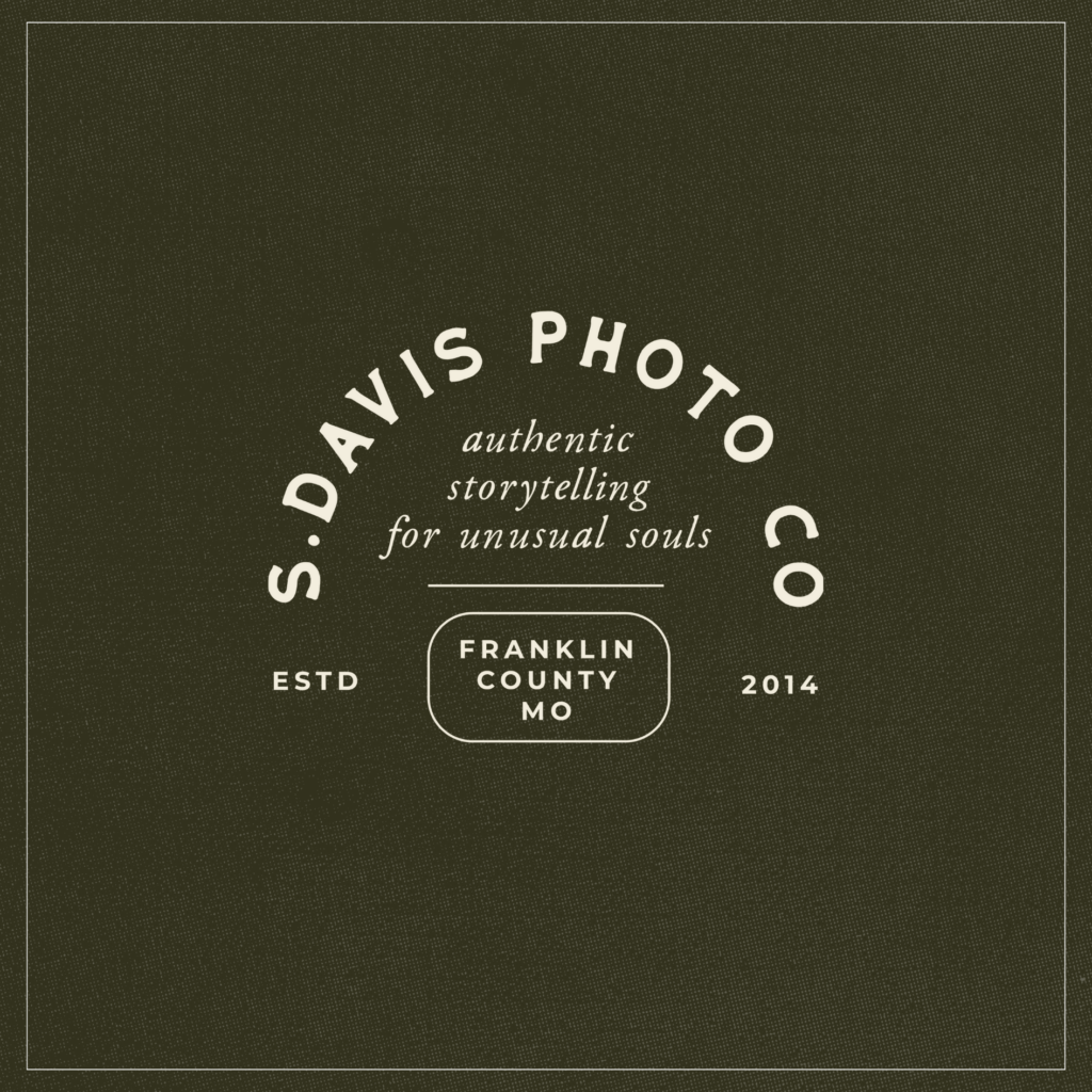
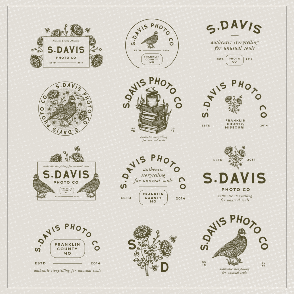
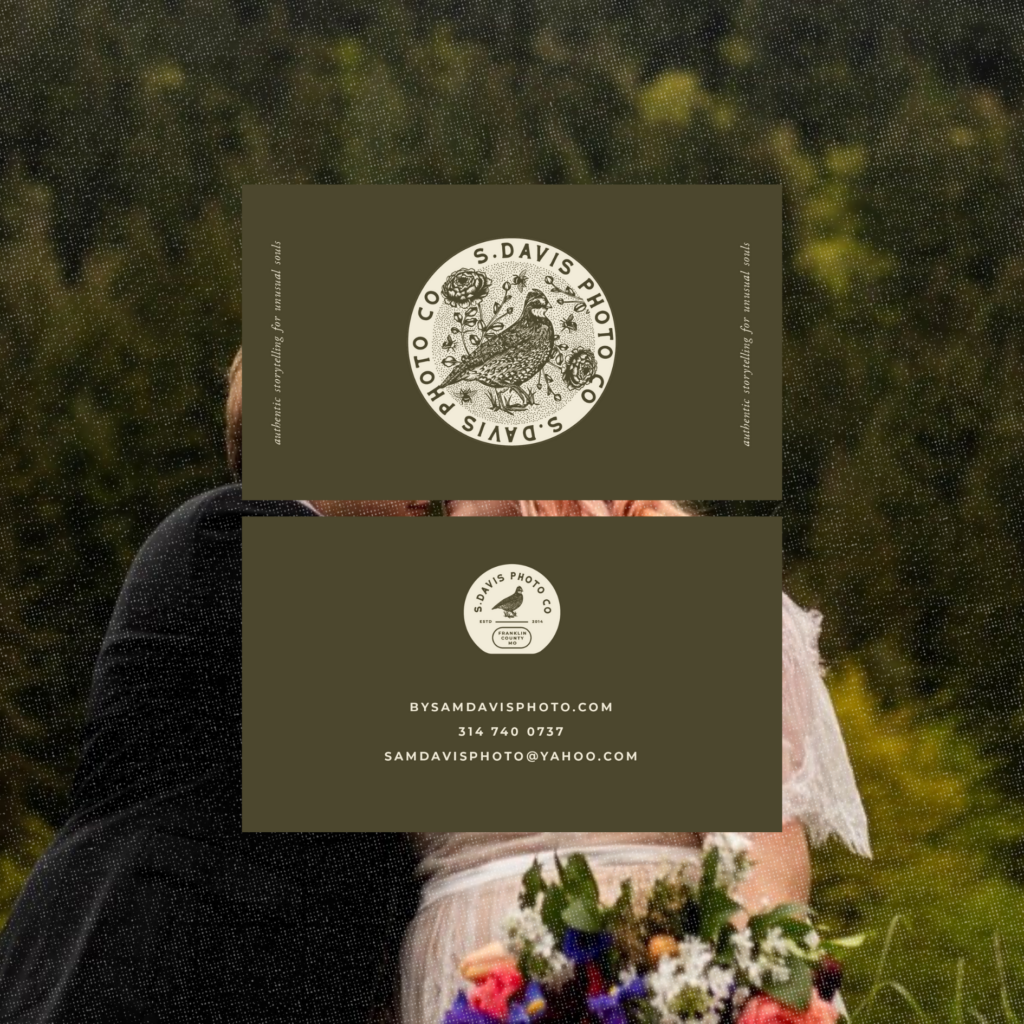
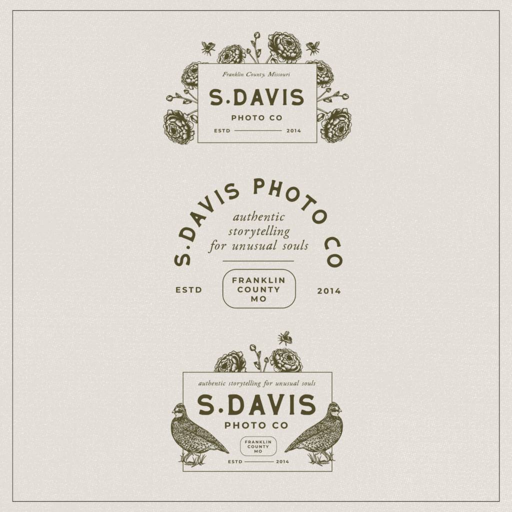
In Sam’s “getting to know you” questionnaire, she made it crystal clear—she’s not one to fit into stereotypes, not even the unconventional ones. She’s all about embracing quirks and authenticity, both in herself and in her clients. This became a core driving force for her brand. And we even came up with the tagline ‘authentic storytelling for unusual souls’. We wanted to steer clear of going too far into quirky, alternative, or non-traditional territory. Those labels can sometimes pigeonhole a brand. So, we settled on describing the brand as ‘unusual’—something less defined and more of a feeling.
She painted a picture of her audience as kind, genuine folks with a love for nature and adventure. These are people with big hearts and creative minds who cherish the small moments just as much as the big ones. While Sam’s audience spans different ages and backgrounds, these values always remain at the core. Her clients flock to her because they feel safe and at ease being themselves. We noticed from this part of Sam’s questionnaire that comfort and coziness were huge aspects of her brand. So, we made sure to weave them into the brand’s core message and overall look.
The inspiration:
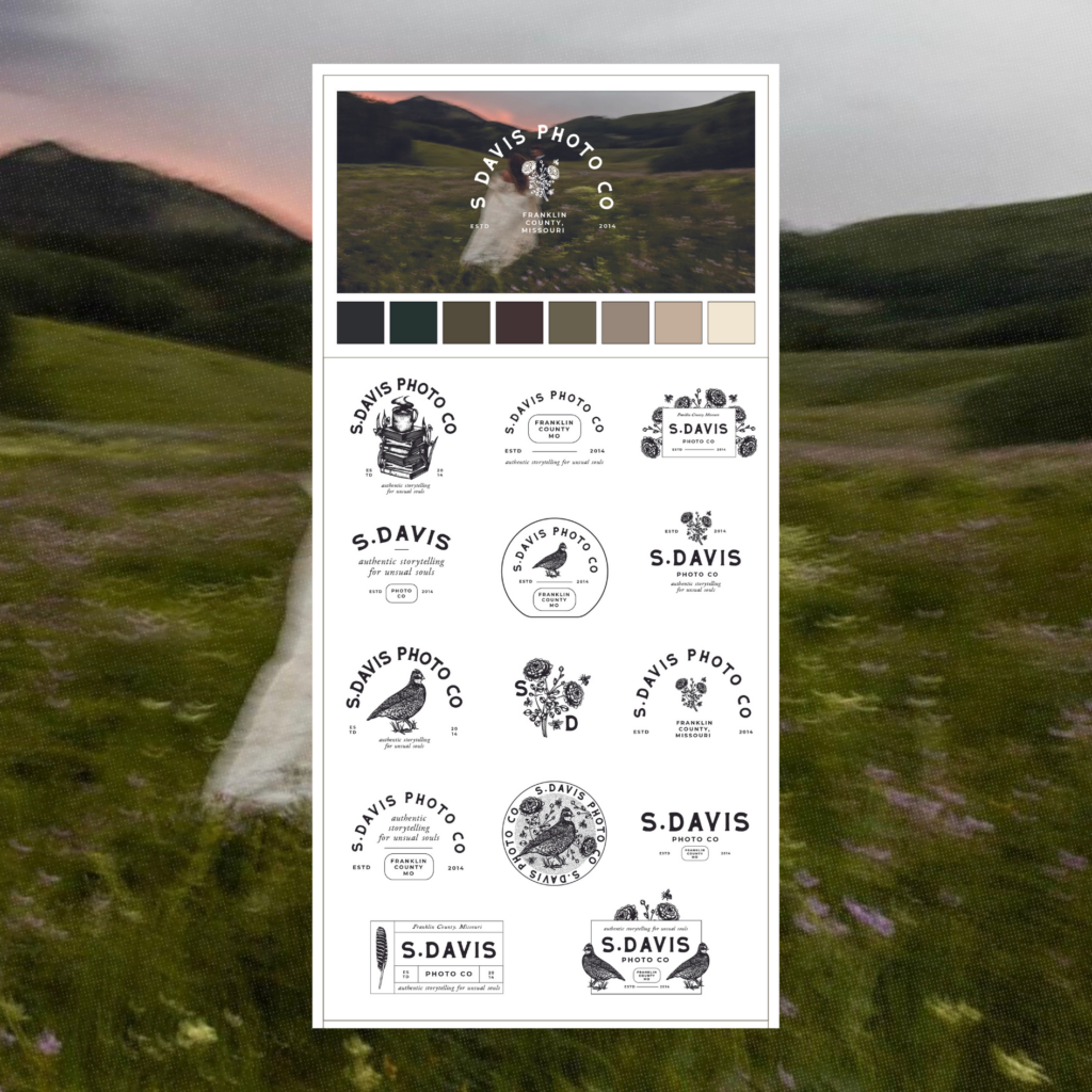
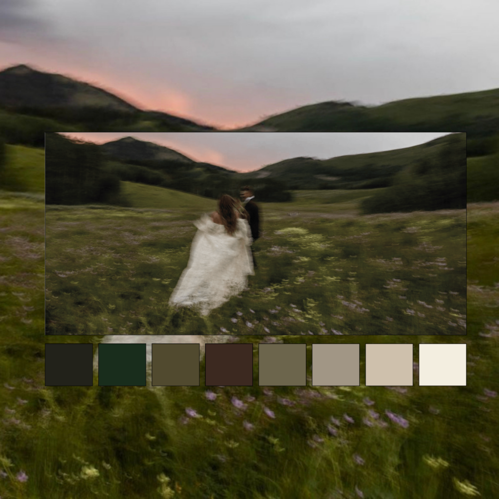
As we sifted through Sam’s Pinterest board, a clear rustic theme emerged. There were these intricately textured and detailed drawings, and fonts with a rustic touch. We decided to run with this idea, infusing a touch of rustic charm into her brand, but in a snug, inviting way. Our inspiration? Picture a warm log fire in a cottage, rather than the rugged, wild expanse of a national park.
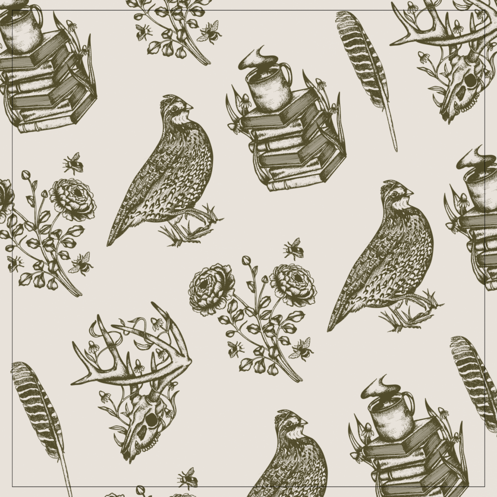
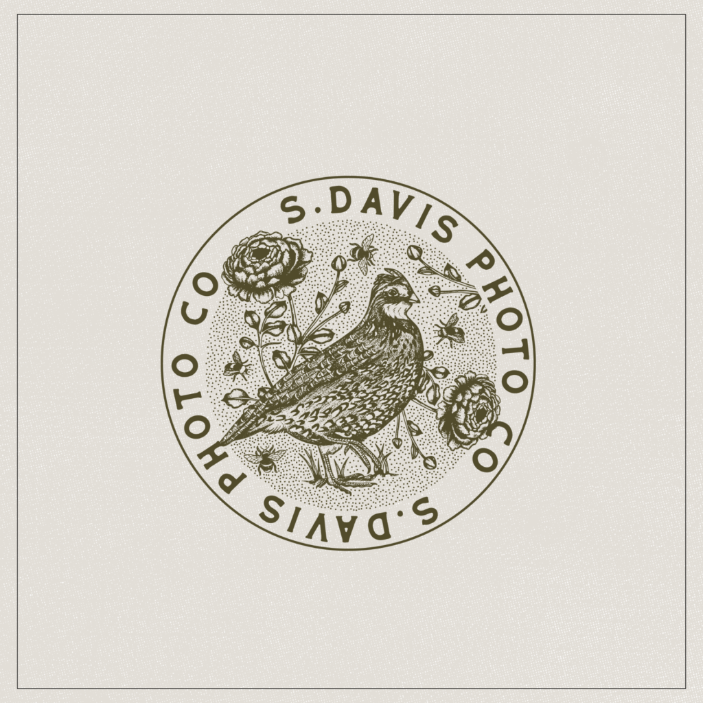
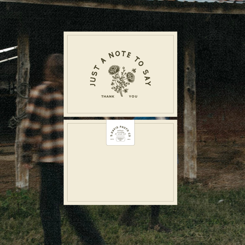
We wanted to harness this rustic, laid-back vibe to create a sense of warmth and coziness throughout the brand. This brought us back to our original inspiration of a brand that’s moody, romantic, yet still warm—capturing a down-to-earth vibe that truly embodies Sam. Sam also gave us some color ideas she was drawn to, and we leaned towards a warmer version of her palette to align with her brand’s tone. She also mentioned some fantastic visual ideas for illustrations and logos. Drawing from her favorite flowers: Ranunculus, as well as some local animal life that holds a special place in her heart. Such as Bobwhite Quail, Quail feathers, and Whitetail deer skulls. We knew we wanted these illustrations to be detailed, adding to that warm, vintage, and rustic feel.
The Review:
“I learned of Kern & Ink while in Utah at a photographer’s retreat. During my 1: 1, I was encouraged to do some more branding to bring who I am and what I bring to the table to the public eye. Kern & ink came highly recommended based on our cohesive styles. After looking over their website, I wouldn’t have picked anyone else. I was without a doubt confused about how to explain who I am but also, my brand. Personally, I have never fit a stereotype – not even the typical stereotype you picture when someone says that. I know who I am but bringing that to life on paper was a challenge.
Sarah brought it all to life for me. Not only did she provide the most beautiful art; which was better than I could have ever dreamed of, she put words together that made me feel like I had a storyline. I went from a lost soul who loved jewel tones to someone who can proudly say I’m some type of cottage core with a passion for telling love stories for unusual souls.
The homework during the project made me cry – in a good way. I had to sit with myself multiple times; sometimes with coffee, sometimes with whiskey, and self-reflect. You asked important, heartfelt questions. I know myself, my brand, and my dreams moving forward in a much more intimate way. The organization on the back end from scott was truly second to none. The entire process was pain-free and without any chaos.
The project turned out even better than I could have dreamed. I fully intend to have these pieces on my walls and my skin as they are so true to who I am and the brand I have put my heart, soul, blood, sweat and tears into. I was so nervous to put all my heart in someone’s hands. When I Inquired I had no idea what I wanted, but all my wildest dreams came to life thanks to their ability to create.
Sarah & Scott breathed life into my brand in a way I can never say ‘Thank You’ enough for. I was very nervous about spending what I did and I would argue that what I spent was worth its weight in gold. Best investment I have ever made.”
Working with Sam has been an amazing ride. It’s been incredible to witness her transformation from feeling a bit lost about her brand to now fully owning it. She’s got something truly special and personal to offer. Together, we’ve not just carved out her brand, but we’ve brought her own vision to life. We’ve watched her embrace her vulnerabilities and champion what sets her apart. Assisting her in doing what she does best – capturing those genuine, heartwarming moments for her clients – has been an absolute pleasure. We’re eagerly looking forward to Sam’s journey with her fresh branding. And you bet we’ll be the loudest cheerleaders on the sidelines!
We hope you enjoyed looking at our Brand Design for Missouri Wedding Photographer, S.Davis Photography. Are you ready to book your rebrand? Get in touch!
filed IN /
MOST POPULAR
Showit website design for photographers