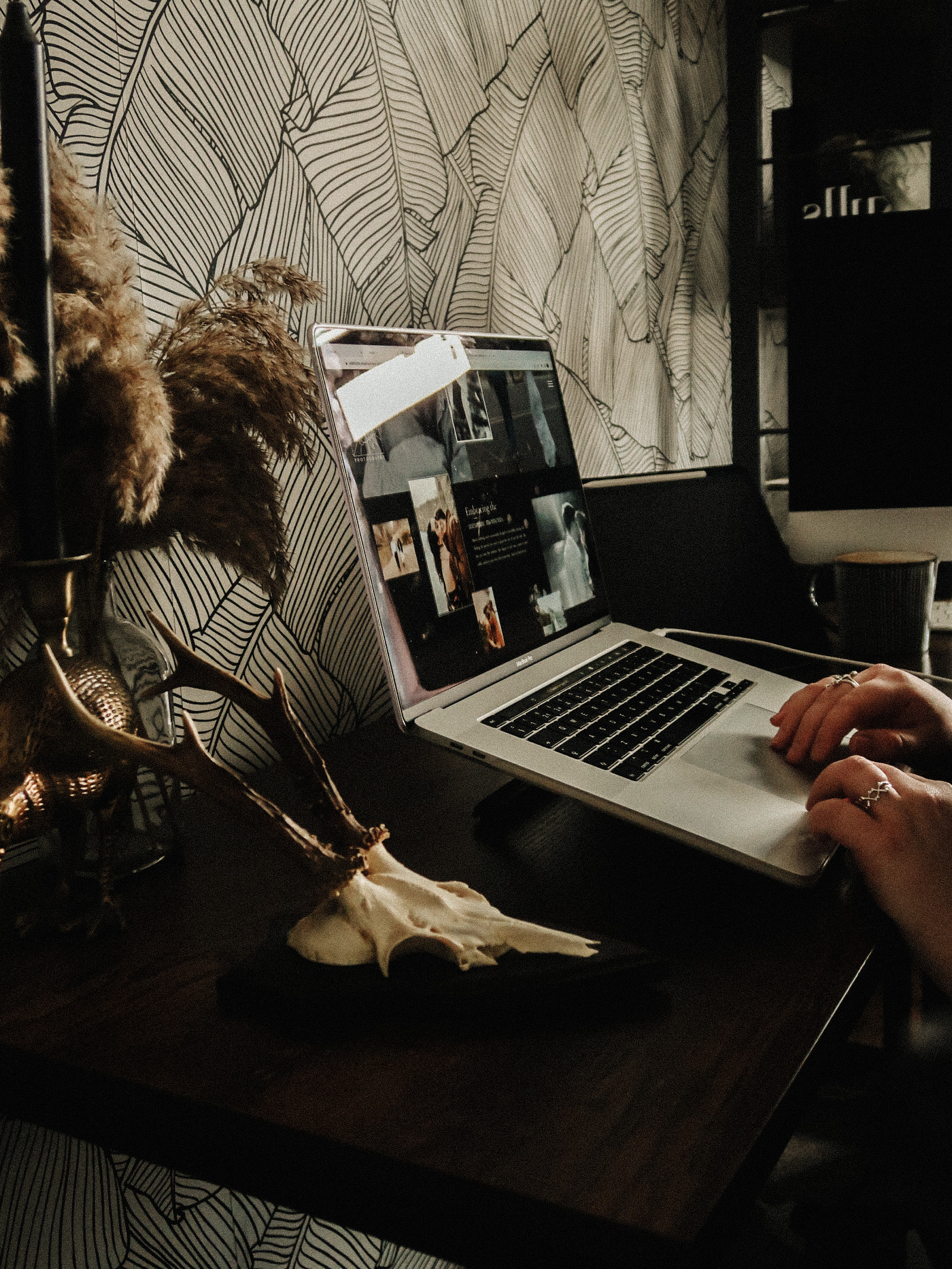
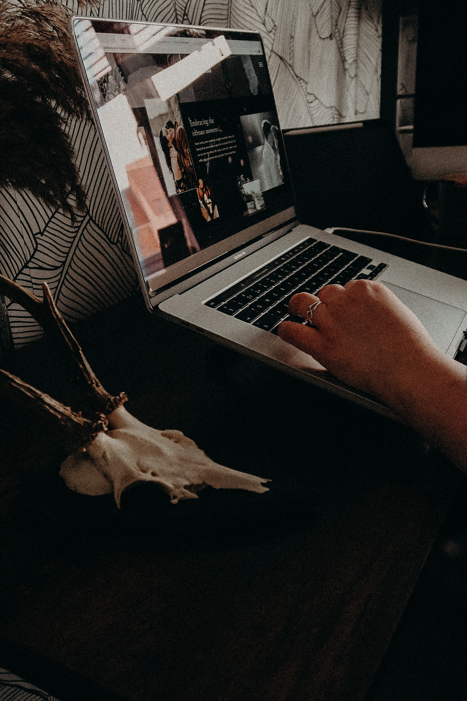
you are reading /
Brand Design for Manchester Photographer, Gail Secker Photography
Brand Design for Manchester Photographer
Service included: Brand in a day
The aim of the Brand Design for Manchester Photographer Gail Secker:
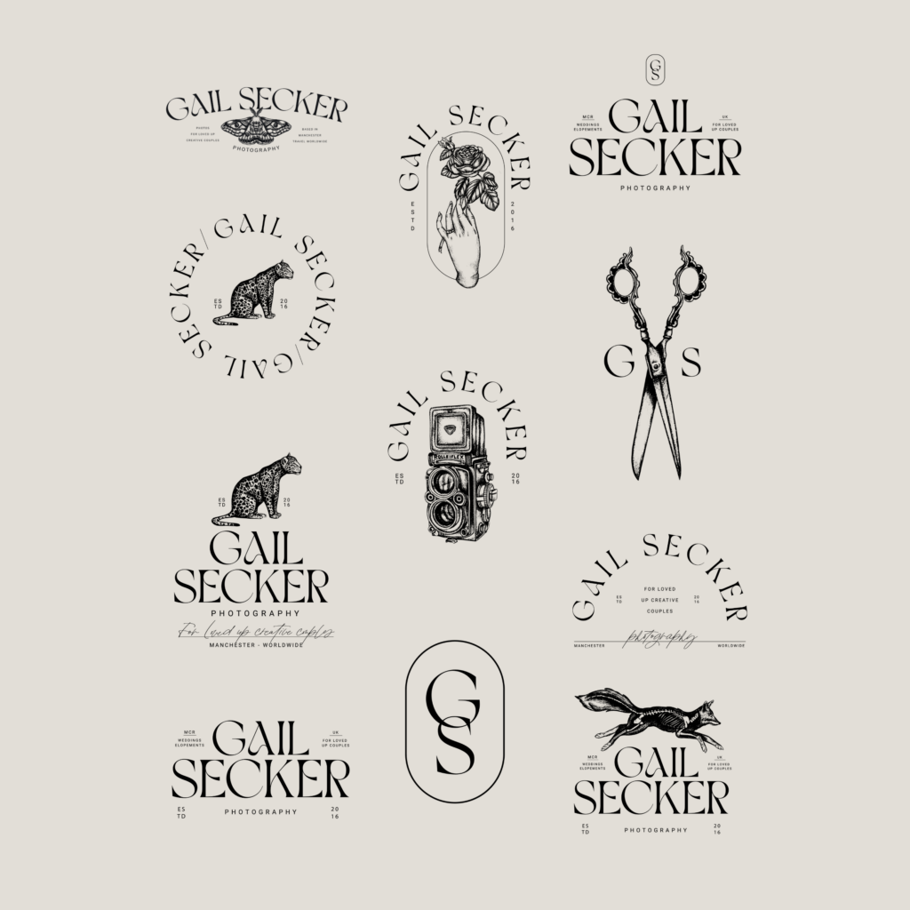
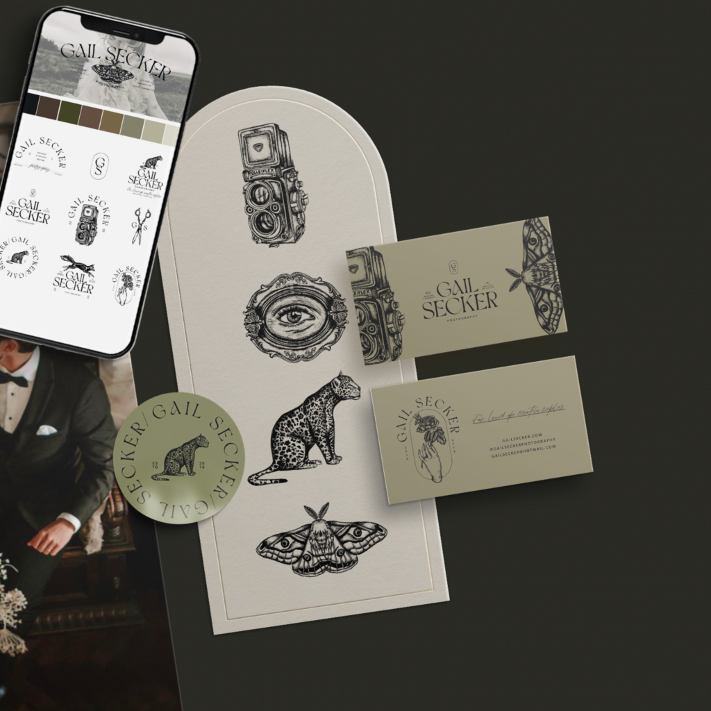
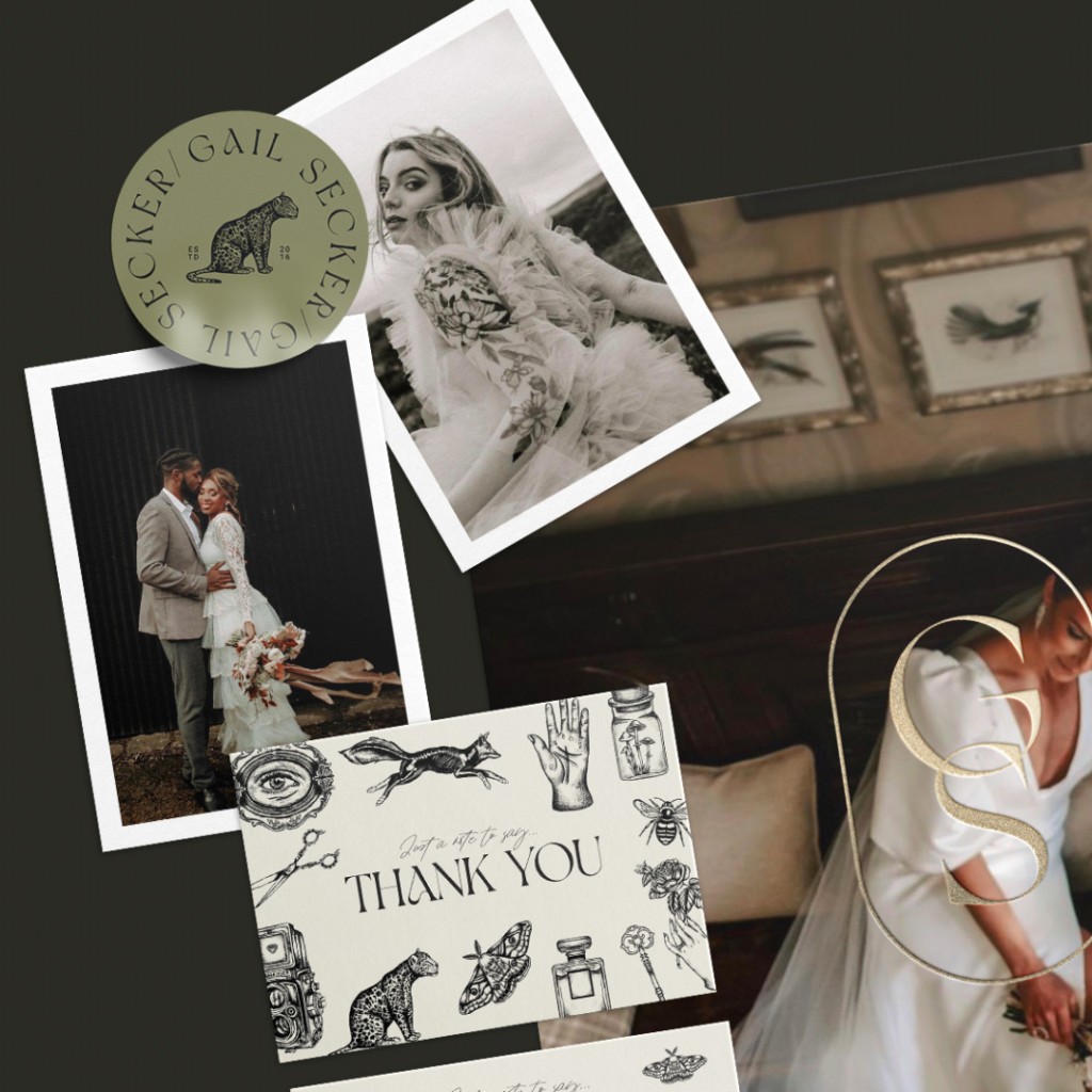
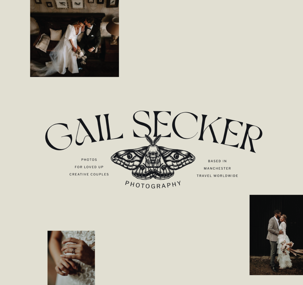
This project was a vintage-inspired Brand Design for Manchester Photographer, Gail Secker, a professional wedding photographer based here in the UK. Gail approached us with a vision for a refined, minimalistic rebranding to complement her raw and almost editorial photography style. She desired an old-fashioned, moody artistic ambiance with a hint of eccentricity in the illustrations. All while, still maintaining simplicity in the fonts and logos. The aim of Gail’s project was to create a brand that was sophisticated, editorial and had a touch of vintage whimsicalness.
The result:
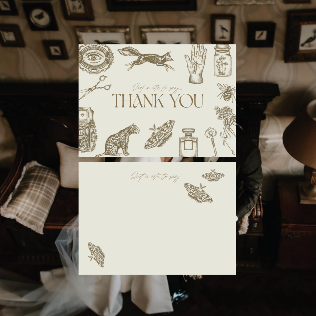
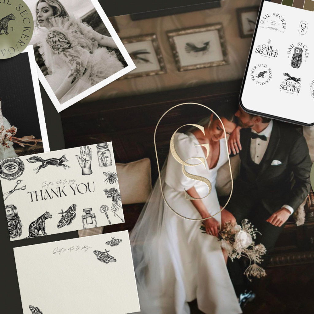
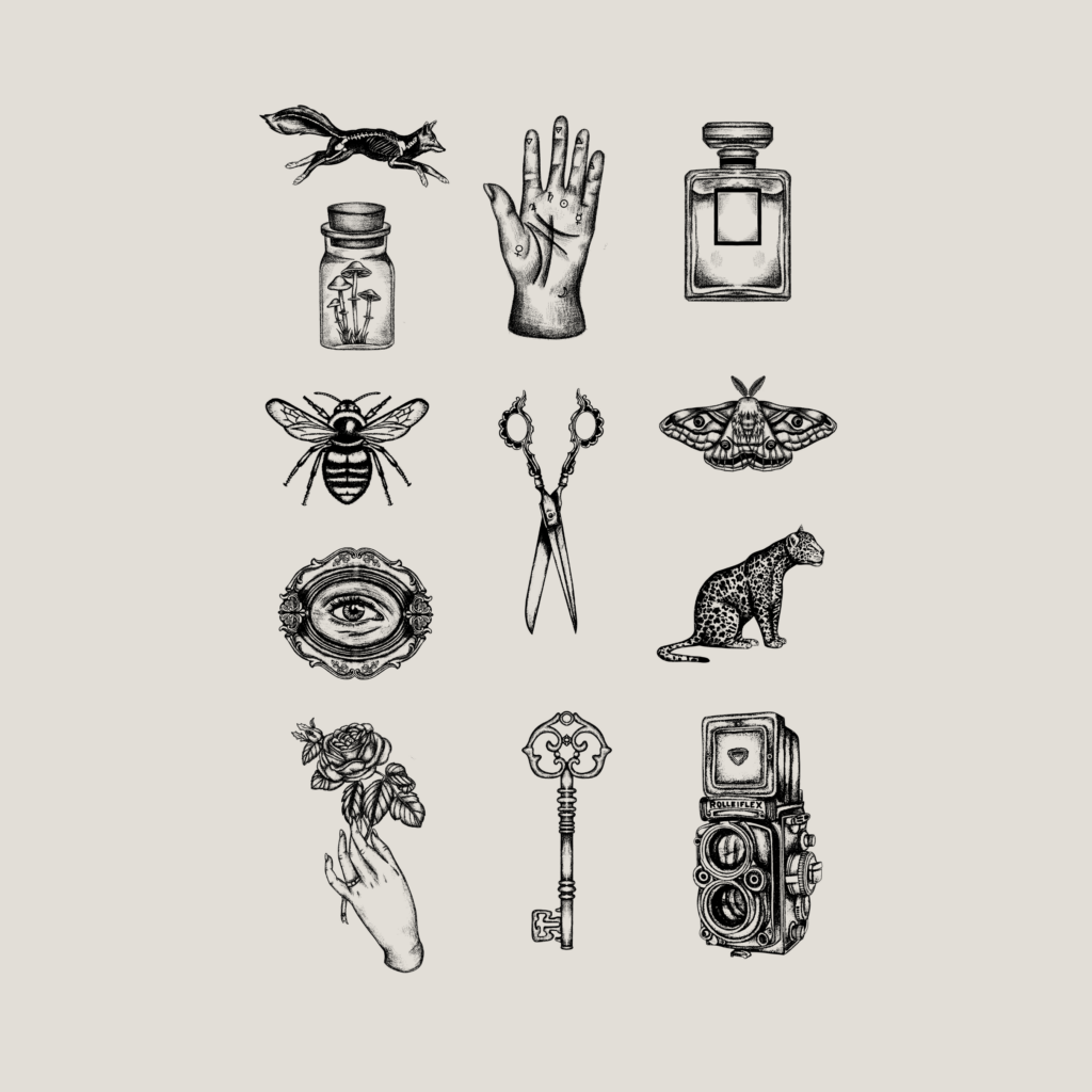
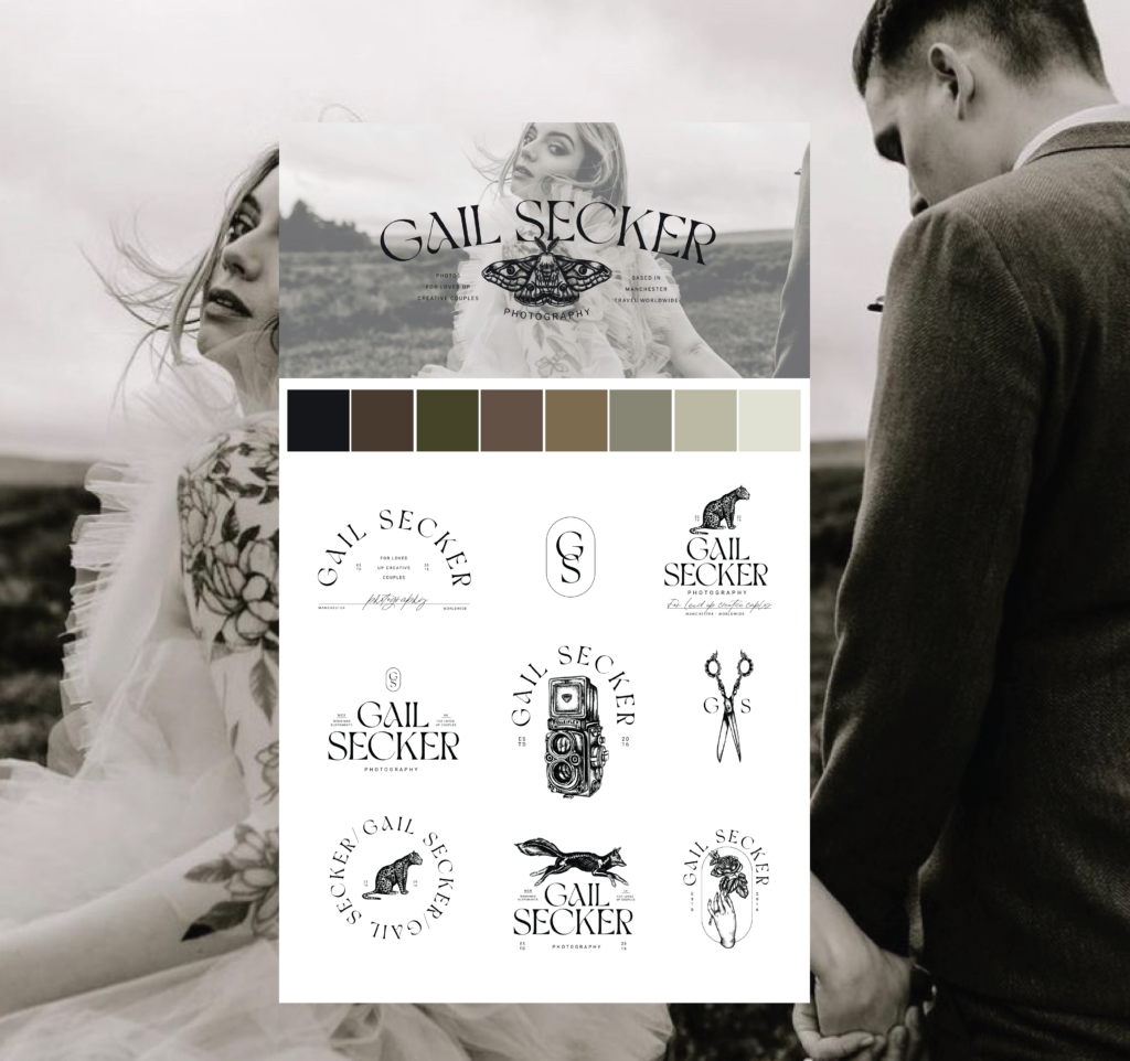
We chose a neutral palette with a brown hue that was inspired by the old dusty library feel. The serif font we chose had clean lines with unusual details in the curves, giving it a sophisticated, quirky, and high-end look. We used a dot work stippling form for the illustrations. This was to create a vintage feel with a gritty and quirky look. Choosing objects that could be found in an antique shop that we felt would match well with Gail’s brand. And we added a leopard for a cool, funky, modern feel, as well as a jumping skeleton fox for a bit of edgy quirk. An illustration we also included was a perfume bottle that spoke to Gail’s luxury city vibe audience. Therefore, creating the perfect blend of bougie and quirky.
Our team was excited to take on the challenge of bringing Gail’s vision to life. We spent countless hours brainstorming and sketching ideas, experimenting with different color schemes and typography choices. We aimed to create a visual identity that reflected Gail’s unique style and felt timeless and sophisticated. The final product was a deep and meaningful project that perfectly captured Gail’s artistic vision. Our illustrations were a particular highlight, infusing a touch of eccentricity and personality into the overall brand.
What Gail said about her brand in a day experience:
I had been following Kern x Ink for several months and was impressed with the quality of their work. Sarah’s illustrative style, which combines tattoo-like pen and ink with whimsical images, particularly caught my eye. I knew that this was the perfect combination for my much-needed rebrand.
Throughout the process, Sarah was incredibly patient and accommodating, addressing all of my questions and concerns with grace and charm. She truly understood my vision and I couldn’t be happier with the final results. Sarah’s expertise in typography is evident in the way she seamlessly incorporated my name into the design.
I must give a shoutout to Kern x Ink for their outstanding customer service and commitment to customer satisfaction. Even though I was mildly demanding (okay, maybe a little more than mildly), Sarah handled all of my requests with ease and a great sense of humour. She truly made me feel like a valued client throughout the entire process.
The end result is beyond my wildest dreams. My brand now exudes sophistication and professionalism, and I couldn’t be happier with the outcome. Thank you, Sarah, and thank you, Kern x Ink, for bringing my vision to life in such a fun and enjoyable way!
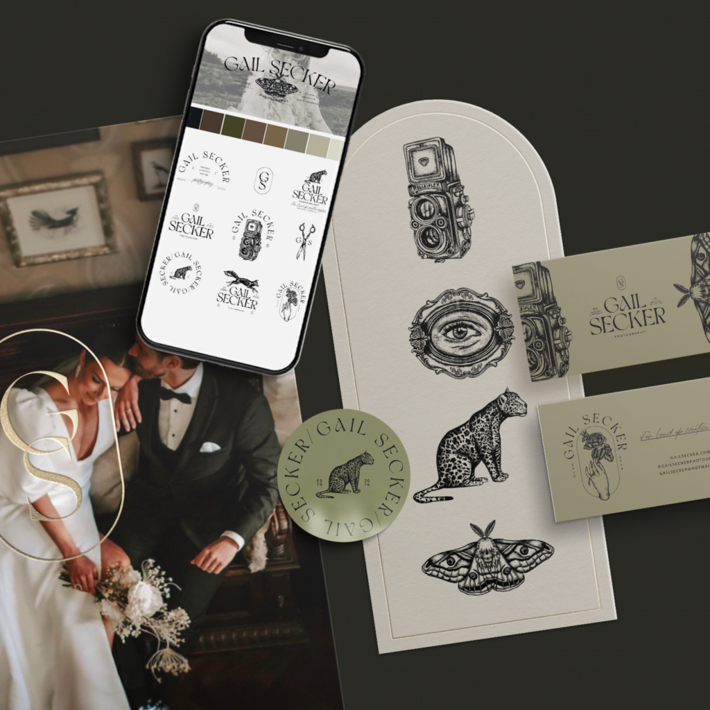
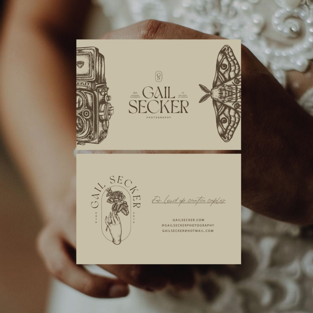
If you loved our Brand Design for Manchester Photographer, Gail Secker and want to create a personality-fuelled brand then get in touch!
We believe your personality and who you are as a business owner are just as important as any aspect of brand strategy. We believe that when you put your personality forward, you attract your dream audience, just by putting your authentic self out there. You’ll find clients who are obsessed with your brand and everything about it because they see themselves within it.
inquire NOW
